

Atlas Ocean Voyages - Yachting Expeditions Website Design
Introduction
Atlas Ocean Voyages, a leader in luxury expedition cruising, needed a full redesign of its marketing website to tell its brand story better, appeal to travelers, and enhance user experience.
As the lead UX designer, I worked on the redesign to improve the booking, search, and “My Atlas” hub experiences. Our mission was to create a website that looks and feels luxurious and offers an intuitive and engaging user experience.
Problem
The website makes it hard for users to find cruise information or book directly, pushing them to look elsewhere, and doesn't give Travel Advisors the up-to-date details they need for Atlas cruises. Plus, a weak search and filter function adds to the difficulty of finding necessary information quickly.
Solution
The website overhaul simplified and improved the user experience by introducing customizable search filters, a story-format interface for personalized journeys, and the "My Atlas" hub for user profiles. Enhanced navigation, visual trip highlights, and updated resources for Travel Advisors streamlined the booking process, making it easier for users to explore and manage Atlas cruises.
My Role
UX Designer - Research synthesis, heuristic analysis, competitors analysis, ideation, wireframing, prototyping, usability testing, and final handoff file.
The Team
UX researcher, content strategist, project manager, two UI designers, and external vendors, developers.
Project Duration
4 months
Process
Discover
Our team held a discovery workshop to start the project, interviewing stakeholders, and target users and analyzing the current site's user experience, SEO, and competitive landscape.
Key problem areas:
Underutilized Website Functionality: A cluttered website with unclear value propositions makes it hard for guests to find information about Atlas and book cruises, highlighting the necessity for a better-organized navigation and a more efficient search.
Insufficient Support for Travel Advisors: The lack of current information and support for Travel Advisors and guests undermines booking efficiency, pointing to a need for more accessible and navigable content that supports both user groups.
Poor mobile experience: With nearly 60% of users on mobile devices, the current site's poor optimization for mobile highlights the urgency for streamlined mobile navigation and search capabilities to improve overall user experience.
Outdated Booking Flow: Guests must book cruises via phone with Travel Advisor which limits flexibility, hurting the brand's appeal and customer satisfaction.
Unique value proposition in luxury cruising space:
Smaller size of yachts offer a more intimate and personal experience and more access to remote locations
Destinations offer inclusive excursions & experiences, and genuine service.
How might we…
Assist people in finding and booking the Atlas cruise that best fits their preferences and needs?
Competitive Research
Competitors research revealed valuable insights that helped us to turn them into actionable recommendations I followed when designing flows.
Streamline Mobile Experience and Navigation: Reduce vertical scrolling on the Atlas homepage for mobile users and ensure page navigation is intuitive, accessible, and mobile-friendly. This approach improves the site experience, facilitates easy browsing, and accounts for the majority of users.
Design User-Friendly Expedition Discovery: Offer an easy-to-navigate format for exploring expeditions, with summarized key details and clear CTAs, enhance the search experience and make booking more straightforward for potential cruisers.
Improve Accessibility of Information and Actions: Make information and actions quickly accessible and understandable, reducing the cognitive load on users and enhancing the usability of the site.
Clarify Page Purpose and Prioritize Top Content: Ensure the purpose of each page is immediately clear and critical content is at the top of the user interface to capture users' attention and improve engagement.
Highlight Expedition Essentials: Present key expedition details clearly to support a more effective search process, enabling users to quickly find the experiences most relevant to their interests.
Creating an Immersive Expedition Discovery Experience
The research phase showed the need to improve the expedition search and discovery process. The challenge was to improve and personalize the process of finding cruises in a way that not only showcased Atlas's strengths but also offered an immersive experience for users.
I expanded the traditional search function by introducing filters that let users create their own journey, balancing luxury with Atlas's unique position among competitors. The search interface, familiar at first glance, transitions to a more interactive experience with filters laid out in a unique story-format style. This approach was informed by competitor research and Atlas's distinct offerings, maintaining familiarity while adding innovation. Initially using radio buttons for selections, I later added images to make the experience more engaging and decisions easier with visual cues.
On the desktop, I utilized the extra screen space by integrating filters directly into the search widget, allowing for seamless exploration without extra clicks. This widget stays accessible as users scroll.


I also created a hub for travelers to manage their cruise preferences, including likes, past, and upcoming trips, preparing for cruises, and tracking membership status, further personalizing the user experience.

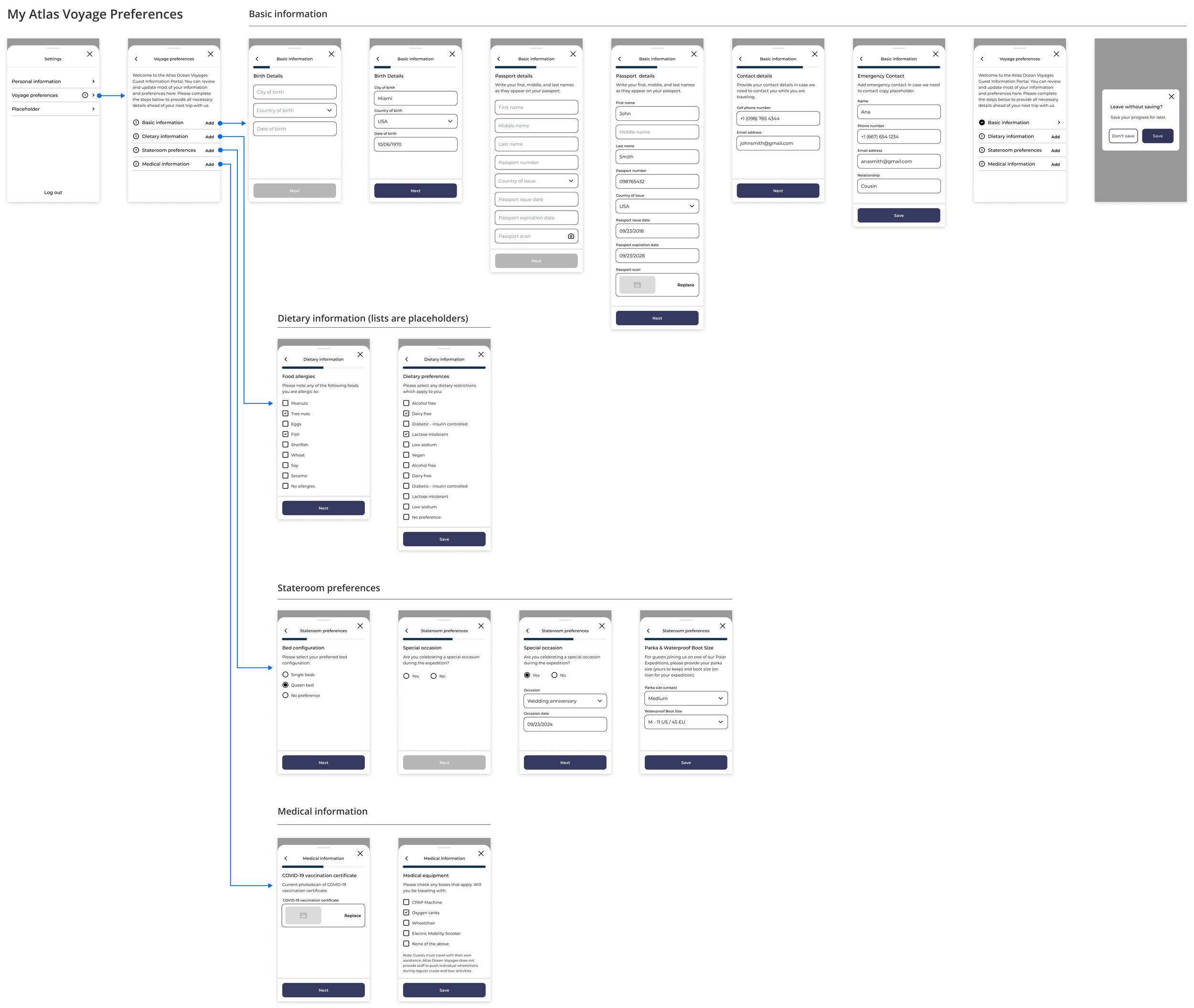
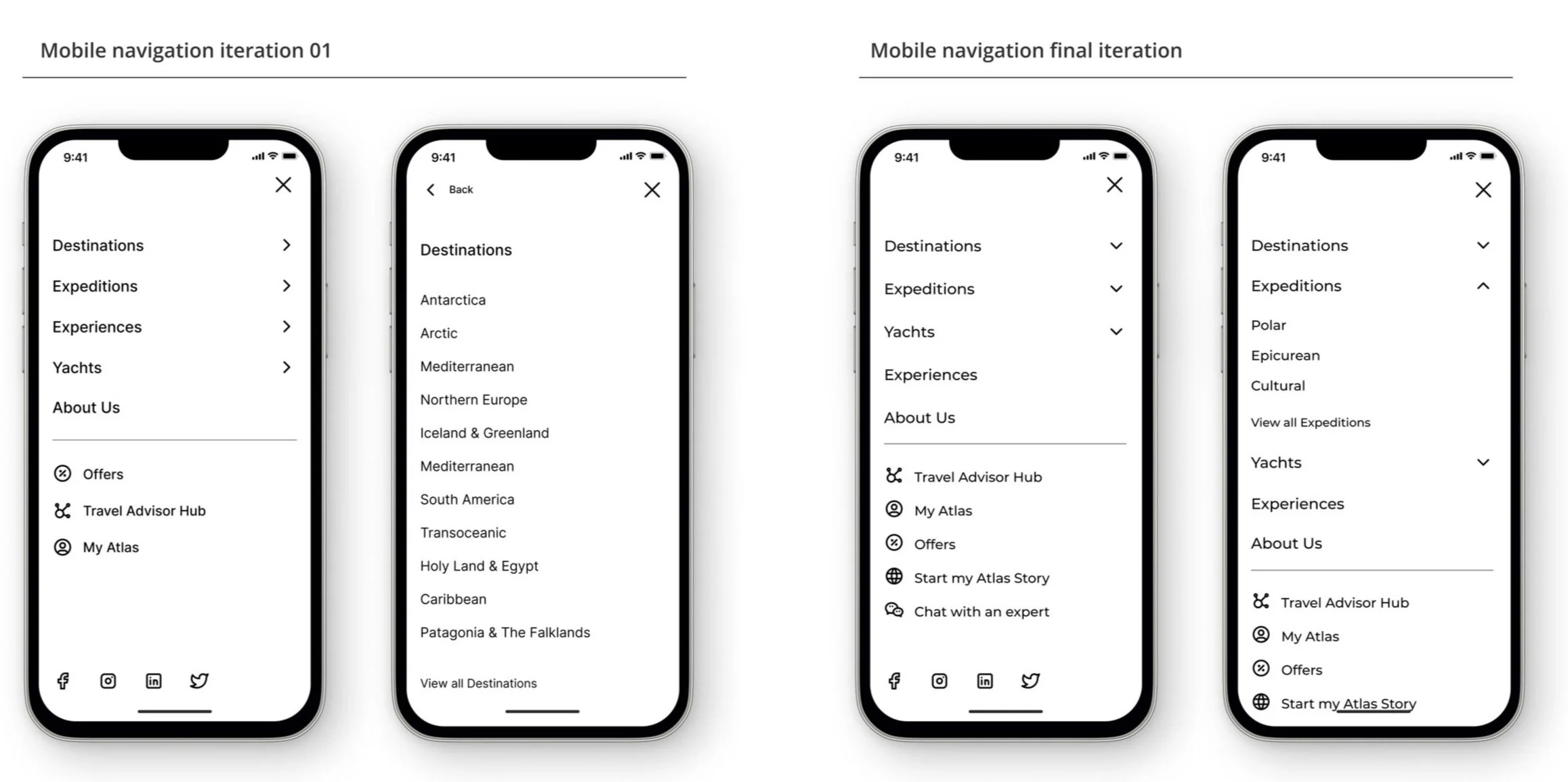
Optimizing Mobile Navigation for Clarity and Ease
Navigating the website seamlessly was crucial, so I refined it several times and conducted user testing to ensure its effectiveness.
Given our site's complex navigation structure, we were concerned users might not realize the top navigation level was clickable because of the chevron showing a submenu. I made two versions of the mobile navigation: one less usual version with separate targets for the label (going to the landing page) and the chevron (expanding sublevels) for direct access to top-level pages, and a more standard version combining the label and chevron into a single clickable area that reveals all navigation options.
User testing confirmed our concern: most participants were confused by the label and chevron directing to different locations, not expecting the label to be interactive. Feedback also highlighted that our slide-in menu made it hard to see how different navigation levels were connected. Based on this feedback, I switched to an accordion-style navigation for a more intuitive experience. Additionally, I kept a "View all Destinations" CTA at the bottom of submenu lists from one of the initial versions, which user testing found to be intuitive and accessible.
Final Designs
After multiple iterations, I had fully built out wireframes that were ready to be worked on by UI designers.
Navigation UI
My Atlas Profile UI
Search Itineraries UI
Outcomes and Lessons
The introduction of a more intuitive search and navigation system, coupled with the personalized "My Atlas" hub, directly addressed the initial challenges, showcasing the importance of user-centered design in the digital landscape. I learned a lot from this project, especially about the importance of constantly testing and getting feedback to improve and innovate. This work opportunity reinforced the idea that simplicity, personalization, and clarity are key to designing successful user interfaces in the competitive travel industry.