

Traveller - iOS Mobile App
Introduction
Problem
Many travelers often get frustrated while trying to plan their trip and organize all travel-related documents. It’s hard to keep track of multiple travel documents such as flight tickets, accommodation reservations, attractions, itineraries because all of these documents come from different sources.
Solution
I decided to follow a human-centered process to have my design decisions to be supported by user research and feedback. I designed Traveller, so that users can quickly upload all travel details from different sources and get an auto-generated itinerary with a map view to follow while traveling.
User Goals
Create a flexible itinerary to be able to utilize while traveling.
Have quick and easy access to travel-related important documents on the app.
Navigate with ease (from any location even without stable wi-fi access).
My Role
This was a solo project - I executed all research, design, prototyping, and usability testing. (UX/UI designer, user researcher)
Project Duration
4 months
Research
Discover
I interviewed 5 vastly different skilled travelers in order to better understand what their main frustrations were with organizing trips. The interview data indicated that people have a difficult time organizing their trips because each detail (transportation tickets, accommodation reservations, attractions, activities) comes from different sources, which makes it hard to organize into one convenient document. Several users said that it’s a challenge to navigate in unfamiliar areas while traveling, and finding chosen attractions in relation to their current location.

I developed two different user personas that enabled me to better empathize with the end-user and follow a human-centered process throughout.


Design
Define & Ideate
The information discovered from my research pointed to the type of product that my users needed - an app that organizes their travel-related details (information/itinerary) with a map view.
In order to quickly validate chosen solutions, I hand-sketched low-fidelity screens on paper and conducted a series of user tests with a clickable prototype uploaded to Marvel.
During this early testing, my users alerted my attention to points of confusion for them, such as the exact purpose of the app, and whether trips and document categories are connected.
I started creating wireframes with two colours, neutral grey, and accent blue. Neutral colour was used to focus on the layout and not the visuals, while the accent blue was used to figure out which elements should be emphasized and highlighted. While designing wireframes, I realized that the Home category isn’t necessary as the Trips category has the same function, so I removed it.


Branding and Style Guide
Because I worked solo on this project, I had to create the branding and style guide for this app myself. I wanted the app to inspire the feelings that travelers felt when they were traveling: excitement, calm, adventurous, and playful.
The name of the app was designed to have this easy-going personality and become a travel companion. I chose the Pacifico regular font (Adobe Fonts) for the logo, which has this flowy, organic shape and encompasses the app’s character well. Other selected elements such as font, illustrations convey the personality of the “Traveller”.


Validate
Prototype & Test
Once I’d determined the basic structure and flow of the app, I began to create a realistic high-fidelity prototype with Invision and XD that I could use to test my interaction design and branding choices with my users.
Using this prototype, I conducted my first round of usability tests, which allowed me to identify a few issues:


I wasn’t sure why most users skipped the onboarding, but was able to identify the issue with the second round of tests. It became apparent that the issue was in the placement of UI elements - call to action button was misleading and pagination was below the button which I updated.
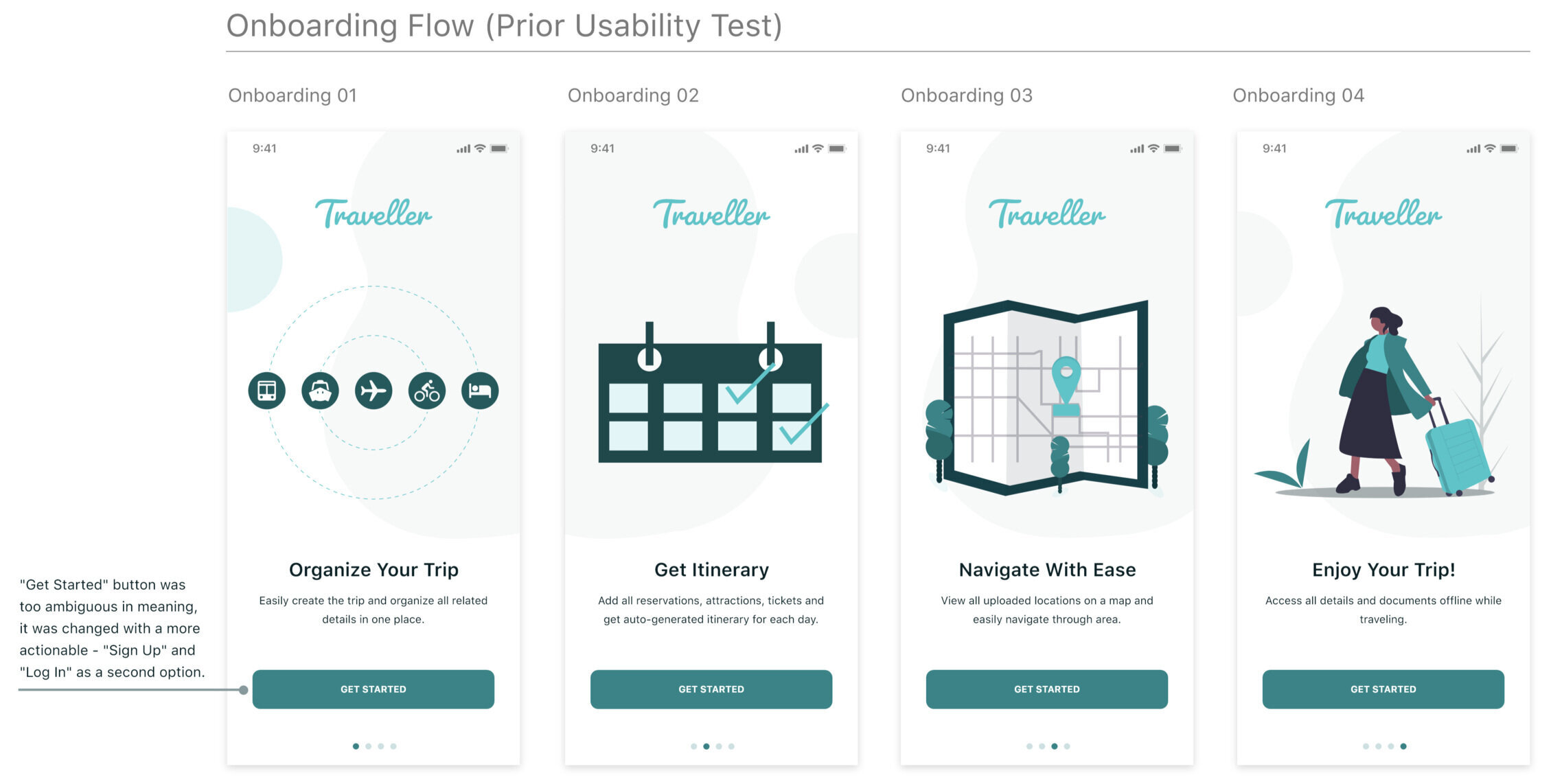

The second round of tests also showed that the issues identified in the first round of tests got fixed as they weren’t brought up anymore. However, another issue was brought up:

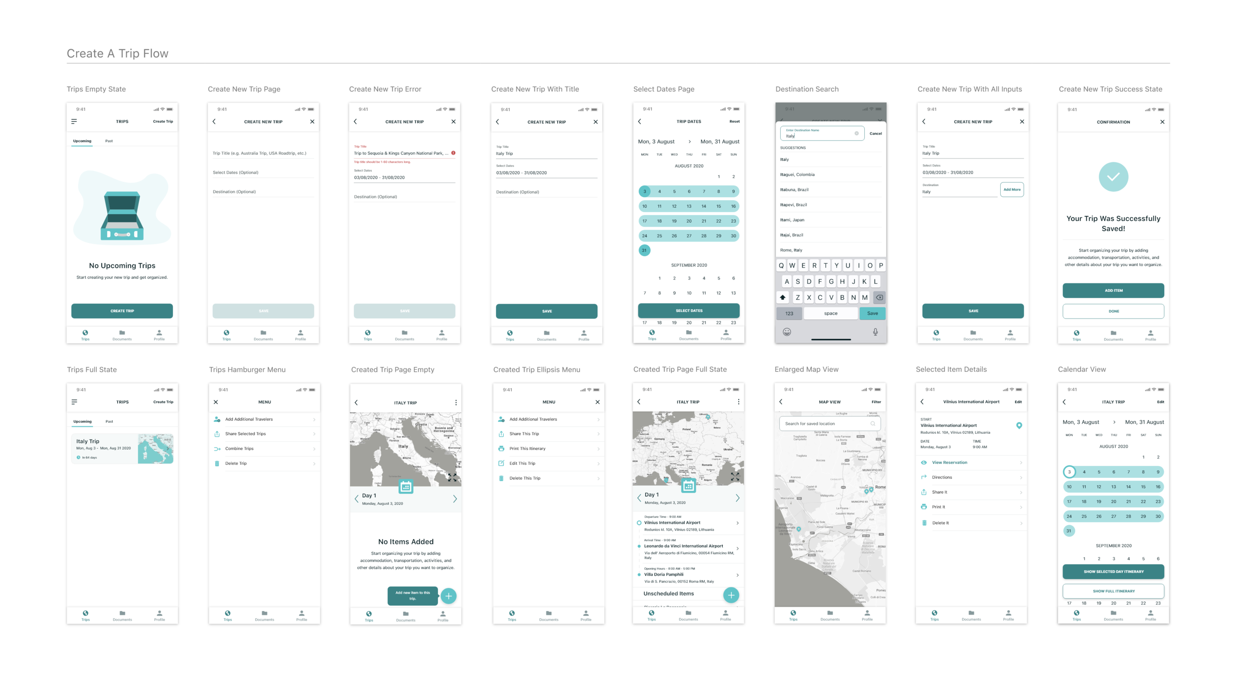
Final UI design

Outcomes and Lessons
This project was my first real experience applying a design thinking process to design an app.
I learned to always test assumptions and have a concrete reason for every element of my design. Also, how it’s important to follow existing patterns and UI elements in order to provide a seamless user experience.
Attribution
Onboarding illustrations drawn by Katerina Limpitsouni at https://undraw.co/, modified by me.
Map illustrations made by Snazzy Maps at https://snazzymaps.com/
“Food & Drinks”, “Events”, “Outdoors”, “Museums”, “ Legal Documents”, “Architecture”, “View”, “Print” icons were made at https://www.iconfinder.com/